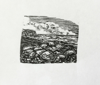
 Beach Pebbles - 39 mm x 32mm
 I've been busy with a few more wood engravings following an afternoon last month spent with Keith Pettit at his studio in East Sussex. I'd organised to have a half day of tuition with him in an effort to move my work on a bit. It was a very interesting afternoon - we didn't do any wood engraving which was a bit disappointing, but we did chat lots and discussed a variety of wood engravers' work and looked at numerous examples. I was very interested to learn how Keith starts on working on a new piece, how he prepares his drawings and how he works on the blocks and finally how he prints. I was surprised that he doesn't make proof prints and just goes for it! It would be great to be that confident. I got to see close up a lot of his work, much of which I really like, and I came away determined to keep going.
Since then I've been working on small practice blocks with the idea of concentrating on specific things. So in the Beach Pebbles piece I wanted to work on stones and water. Some parts work ok and I liked the looseness of the marks I made on the pebbles - it's a start.
Since then I've been working on small practice blocks with the idea of concentrating on specific things. So in the Beach Pebbles piece I wanted to work on stones and water. Some parts work ok and I liked the looseness of the marks I made on the pebbles - it's a start.
| I've also been reading lots of books including Simon Brett's "Wood Engraving How to do it" in which he says the engraver should work from dark to light on the block. He suggests the block should be darkened with an ink wash and the design painted on with white gouache. Black areas are left alone, working on the next darkest tone through to the lightest tones and finally to white. My second attempt was an effort to work in this way. The proof print was far too dark so I reworked some areas but feel this made it worse. Hey ho - lesson learned! I'm not sure this way of working suits me but I'll keep trying. |
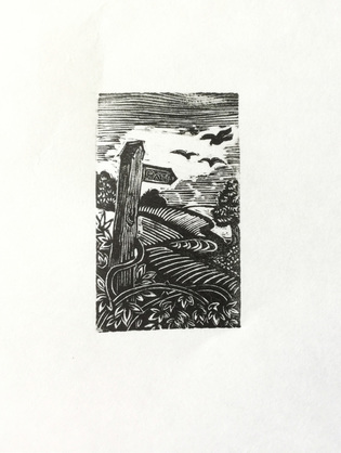 The Signpost - 28mmx46mm
 This block worked out much better despite being really small. I'm having to work with a magnifying glass and strong light - dodgy eyesight! It's not a recommended way of working and I can definitely see why. It's hard to judge how deep or how close together the cutting marks are as they're magnified with the result that the blocks can print far too dark. However - it's something I'm slowly adapting to.
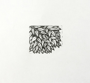 Leaves - 35mm x 41mm
 This block was an exercise in cutting leaves overlapping one another with clearly defined areas of white and black. I drew directly onto the block this time and didn't bother to ink the design either. I liked working this way.
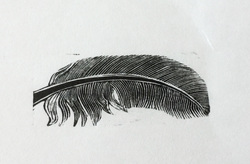 Exercise in cutting lines - 20mm x 49mm
 I saw a feather on the lawn and immediate thought I'd have a go at engraving one to practice cutting regularly spaced lines - hit and miss on this but some of it worked out ok.
I'll continue working on the block to try and add some pattern to the feather. I haven't worked how I'll do this yet and could end up ruining the the whole thing but if I won't know until unless I try.
I'll continue working on the block to try and add some pattern to the feather. I haven't worked how I'll do this yet and could end up ruining the the whole thing but if I won't know until unless I try.
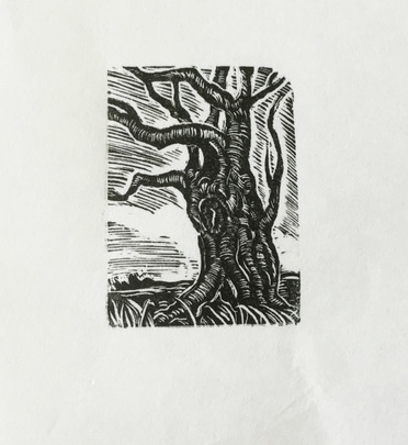 A gnarled tree - 30mmx42mm
 Another small block where I just drew straight onto it with pencil and didn't bother to ink in. I like the looseness of it. The goal was to make marks to show the form of the tree as well as some clear light and shade. It worked better than I thought it would. Next step is to try some different bark textures and to work on achieving a variety of tones... back to practicing working dark to light.
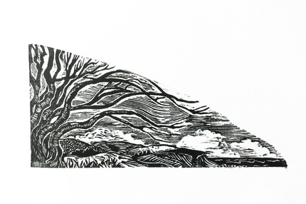 Landscape - 83mm x 39mm
 This tried to use the shape of this block to create a sense of movement and distance when I sketched out the initial idea. I like the tree but feel the sky needs clearing better and I might even take much of it out later. But all in all I was pleased with the overall image even if some of the mark making is decidedly iffy.
 RSS Feed